LETTERING: INTRODUCTION
Writing titles on drawing sheets, dimensions on drawing objects, special notes, and other important particulars on a drawing is called Lettering.
It is a very important step in an engineering drawing. Lettering should, therefore, be done properly in a clear, legible, and uniform style. It should be in plain and simple style so that it could be done freehand and speedily.
Any ornamental style must be avoided lettering in engineering drawings. Though accurate and neat drawings may be drawn yet sometimes, their appearance is spoiled by ornamental lettering or sometimes, their usefulness is decreased by poor lettering.
Note: The use of drawing instruments in lettering takes considerable time and hence, it should be avoided to save time, especially in the examination hall. Efficiency in the art of lettering can be achieved by careful and continuous practices.
**Actually, a free hand drawing means,
"keeping almost the same visual shape, you can draw any component with or without instruments".
You can use any kind of drawing instrument to draw but this is not mandatory to draw an object with its true dimensions.
The visual structure of the drawing should be the same as much as possible. So you should practice this regularly to improve your ability and save a lot of time during the examination.
TYPES OF LETTERING OR CLASSIFICATIONS OF LETTERING :
◆ According to stroke, there are mainly two types of lettering present in engineering drawing. Those are...
1. Single Stroke Lettering.
2. Double Stroke Lettering.
( N.B. Nowadays, there is a new lettering style named 3D Lettering which has an increasingly huge application in various engineering fields, yet, it solely comes from an integrated form of double-stroke lettering. )
1. Single Stroke Lettering :
The Bureau of Indian Standards (BIS) recommends a single-stroke lettering style (IS: 9609-2001) for use in engineering drawing. These are the simplest forms of lettering and are basically used in most of the engineering drawings.
The word Single-Stroke means that the thickness of the line of the letter should be such as it is obtained in one stroke of the pencil. For practice in schools and colleges, the thickness of lines for lettering should be considered as 0.5 mm. However, it is different as per BIS (IS:9609-1983) which is used in industry. We will discuss it later.
2. Double Stroke Lettering :
Double-stroke lettering means that the thickness of the letter should be such as it is obtained by the double strokes of the pencil and the distance between two strokes should be considered as the thickness of the letter. However, nowadays, double-stroke lettering is rarely used.
◆ According to the inclination of letters, there are two types of lettering present in engineering drawing. Those are as follows...
1. Vertical Style: When lettering is drawn at an angle of 90° with the horizontal plane, is called Vertical Lettering or Vertical Style Lettering.
2. Inclined Style: When lettering is drawn at an angle of 75° with the horizontal plane, is called Inclined lettering or Inclined Style Lettering.
◆ As per style, lettering is generally four types :
| Sl.No. | Lettering Types |
|---|---|
| 1. | Roman |
| 2. | Italic |
| 3. | Gothic |
| 4. | Text |
(i) Roman:
Vertical letters are perpendicular or making 90° with the horizontal plane. The size of a letter is mentioned by the letter height.
Roman letters consist of bold and thin lines or all letters have the elementary strokes termed as "Accented".
(ii) Italic:
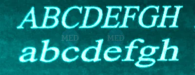
Italic style lettering or Inclined letters are sloped to the right, the angle of letters being 75° with the horizontal plane. The size of a letter is mentioned by the letter height.
(iii) Gothic:
A lettering where all letters have elementary line strokes of even width is known as Gothic style.
In Engineering drawing, the Gothic lettering style is mostly used for lettering in schools, colleges, and industrial sectors. Lettering in Gothic style is also recommended by the BIS system.
(iv) Text:
Except for the above-mentioned three lettering styles, all other styles are termed Text Styles including Old English, German Text, etc.
Text styles are illegible for commercial purposes and not recommended as standard lettering styles for engineering drawings.
Relation Between Letter Heights, Widths, And Line Thickness In Standard Lettering According To BIS :
The standard heights of letters recommended by BIS (IS:9609:-1983) are in the progressive ratio of "square root 2". The standard heights of capital or upper case letters are 2.5 mm, 3.5 mm, 5 mm, 7 mm, 10 mm, 14 mm, and 20 mm.
Similarly, the standard heights of small or lowercase letters (without tail or stem part) are 2.5 mm, 3.5 mm, 5 mm, 7 mm, 10 mm, and 14 mm.
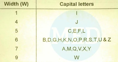
There are two types of standard ratios for the line thickness (d) and letter widths (w). Those ratios are characterized as Type-A and Type-B. In Type-A, the line thickness (d) of letters is h/14, and in Type-B, the line thickness (d) of letters is h/10, where, h=letter height.
The width (w) of various letters is considered in terms of multiplication of line thickness (d) as shown below in the charts, as per BIS (IS:9609:1983).
Lettering Type-A :
Width For Capital or Uppercase Letters :
Width For Lowercase Letters and Numerals :
Lettering Type-B :
Width For Capital or Uppercase Letters :
Width For Lowercase Letters and Numerals :
Relation Between Letter Heights And Spacing Of Letters In Lettering:
According to the BIS system (IS:9609-1983), recommended spacing between letters, spacing between words, and spacing between baselines are directly related to the height of letters as shown in the following figure and tables.
Where,
h = Height of capital or uppercase letters.
c = Height of small or lowercase letters.
a = Spacing between letters.
b = Spacing between baselines.
e = Spacing between words.
d = Thickness of lines.


